
Category: Uncategorized

Feedback from music magazine sketches
Feedback from George:
The sketches for the music magazine have been laid out nicely and clearly, with good explanation. They also give a good idea of the background colour and the main features of the magazine. The double page spread could be better proportioned and more accurate to the actual size.
Feedback from James:
I like the sketches as they show how the magazine will look and the colour scheme. However they could be more accurate and the boxes could look better and not overlay each other.
Music magazine front cover analysis


Photoshoot Plan


Sketch of music magazine front cover, contents and double page spread

Front cover

Contents page

Double page spread
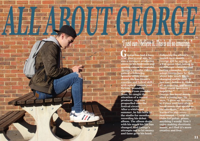
My front cover sketch has planned out the layout for how I want my front cover to look and I want the image of my model to cover the whole page. There will also be text and a quote, probably from ‘Drake’ as he is the main target of the magazine. The layout is also inspired by other Drake and R&B magazines.
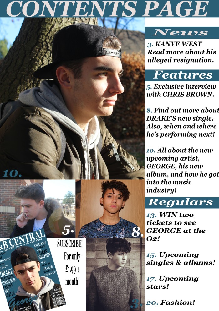
My contents page sketch will have more text than pictures as it will show the features of my magazine.
My double page spread will be laid out evenly so it is neat and eye pleasing, with pictures and text to comfort the page.
All sketches are Drake and R&B inspired as I have looked at the magazines and stylised mine to be similar.
Masthead sketches

I have tried out various fonts and colours to see what would go best. The first white one is the one i will be using because it looks the best.
Masthead Analysis
Target audience – music magazine
General
Age: Teenagers
Location: England
Gender: Male
Income level: Comfortable middle class
Education level: Fairly well educated (at secondary school)
Marital or Family Status: Parents/Siblings
Occupation: Part-time job
Ethnic background: Everyone
Specific
Personality: Happy, nice person
Attitudes: They have a positive attitude
Values: Family, friends
Interests/Hobbies: Listening to music
Lifestyles: Healthy
Behaviour: Well behaved
Double page spread analysis
Analysing music magazine contents pages


